Singular’s overlay builder, Composer, is where you create and edit your custom HTML overlays.
The Main Areas of Composer
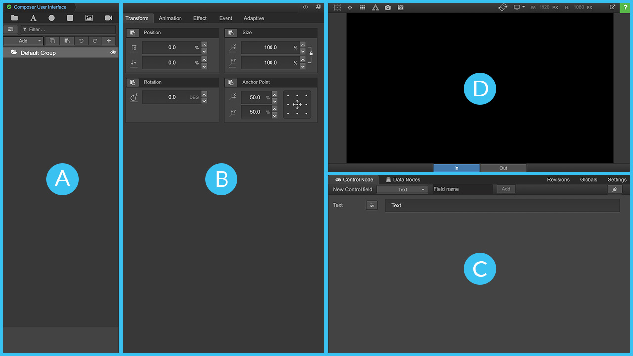
Main Areas of Composer (A-D)
Composer is comprised of four main areas: the Composition Tree, the Property Panel, the Data Interface and Control Panel, and the Output Window.
A - Composition Tree
Shows the organizational structure of the elements in your Composition or Subcomposition.
B - Property Panel
Contains various editors to modify and change parameters of the selected widget, group or subcomposition.
C - Data Interface and Control Panel
Where you can define links to external data and specify the Widget properties you want to expose to external Control Applications
D - Output Window
Where created overlays are previewed.
The Fundamental Composer Elements
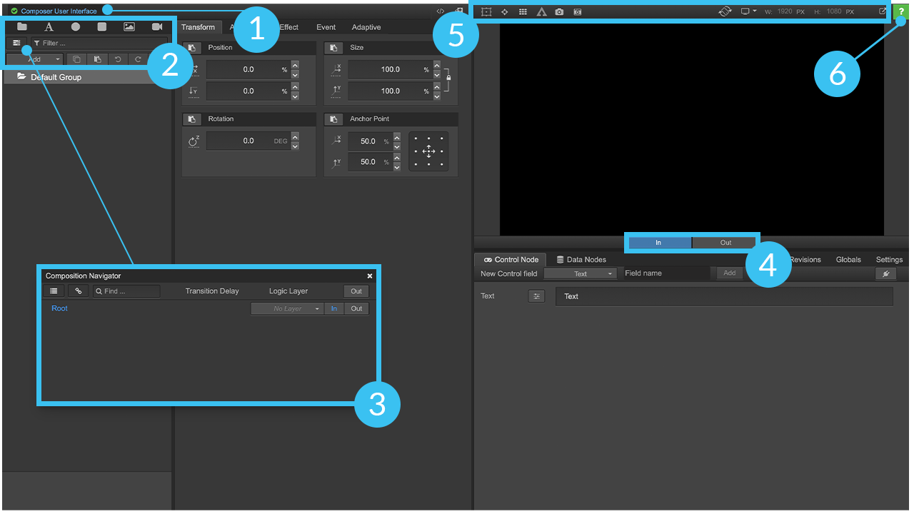
Fundamental Composer Elements (1-6)
There are more specific areas within Composer such as the Composition Breadcrumb, Composition Tree Toolbar, Composition Navigator, In and Out Buttons, Preview Toolbar, and the Singular Support Button.
1 - Composition Breadcrumb
Tab section at the top left that indicates which where you are currently located in your composition.
2 - Composition Tree Toolbar
Located above the Composition Tree (A), this toolbar allows you to add, copy, and paste elements such as widgets, groups and Subcompositions in your Composition. It also contains a search bar, undo/redo buttons, open/close all groups buttons, and the Composition Navigator (3) button.
3 - Composition Navigator
A floating User Interface for navigating between different subcompositions within your composition. This is where you can trigger In and Out Timeline Animations, assign a subcomposition to a Logic Layer, and adjust Transition Timers. It is accessible by either selecting the Composition Navigator button in the Composition Tree Toolbar (2) or by using the shortkey Command + F (Mac) or Control + F (PC).
Click here for a tutorial on how to use the Composition Navigator.
4 - In and Out Buttons
Buttons used to trigger In and Out Animations.
5 - Preview Toolbar
A toolbar within the Output Window (D) section of the user interface where you can turn on/off bounding boxes, choose the aspect ratio of the device or the composition you want to build for, take a thumbnail snap of the frame, or open a new tab to see the output of your work in a clean page.
6 - Singular Support Button
The Support Button is used to call up the Singular Support Widget.
Comments
0 comments