Circles are typically used for creating clocks or other time-related elements, pie charts, show logos, and backgrounds. It can be used as a full circle or portion of it, such as an outline or slice.
To learn how to add a Widget to your Composition, click here.
Remember, any underlined widget properties can be connected to a Control Node or a Data Node.
Properties
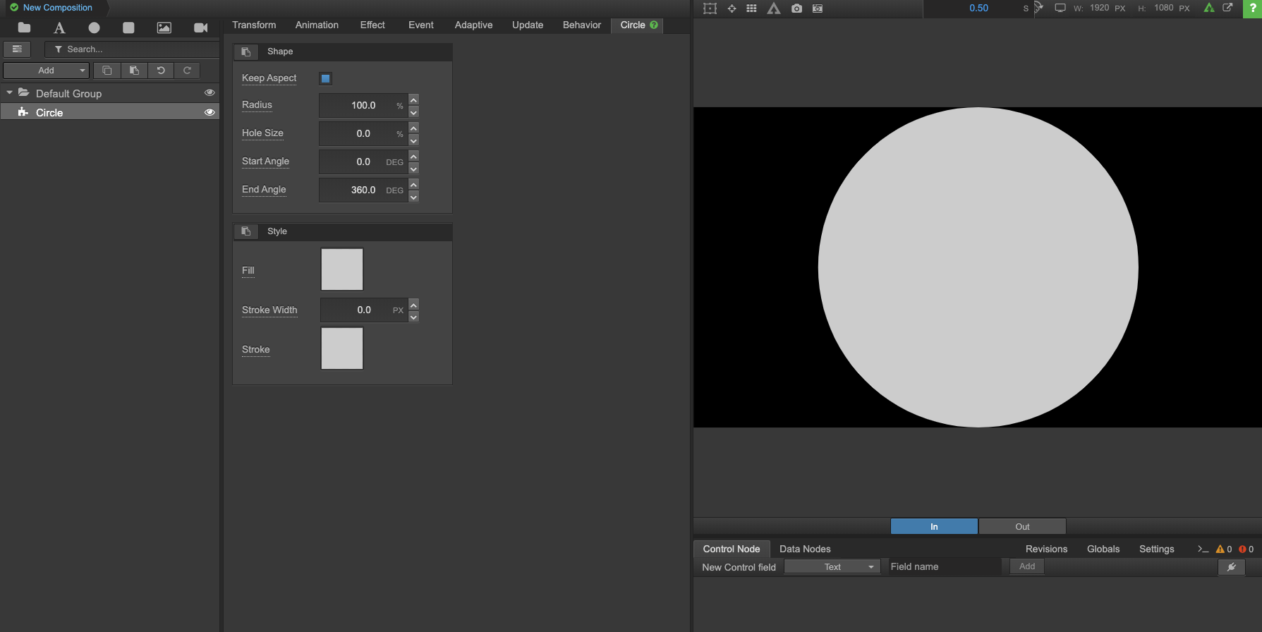
As seen above, select the "Circle" tab in the Property Panel to update this widget's following property types:
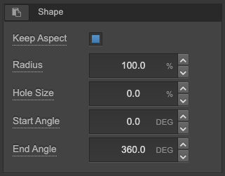
Keep Aspect - Keep or remove the aspect ratio.
Radius - Radius percentage size. Essentially the size of the circle.
Hole Size - If you want a hole in the center of your circle, this is where you can define the size of it.
Start Angle - For creating a pie shaped cuts out of your circle.
End Angle - For creating a pie shaped cuts out of your circle.

Adjusting the Shape Settings
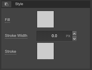
Fill - Select a fill color for the circle.
Stroke Width - Define the stroke (or border) width.
Stroke - Select a stroke color.

Adjusting the Style Settings
Comments
0 comments